Good use of Typography and Photography in a Magazine

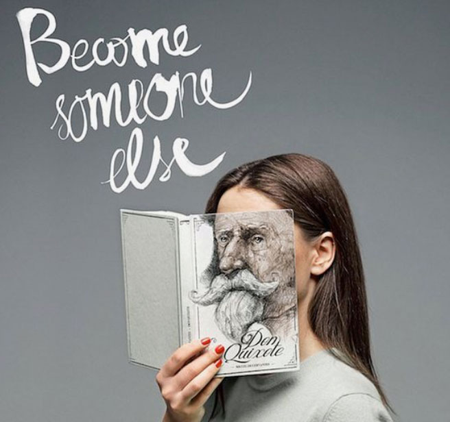
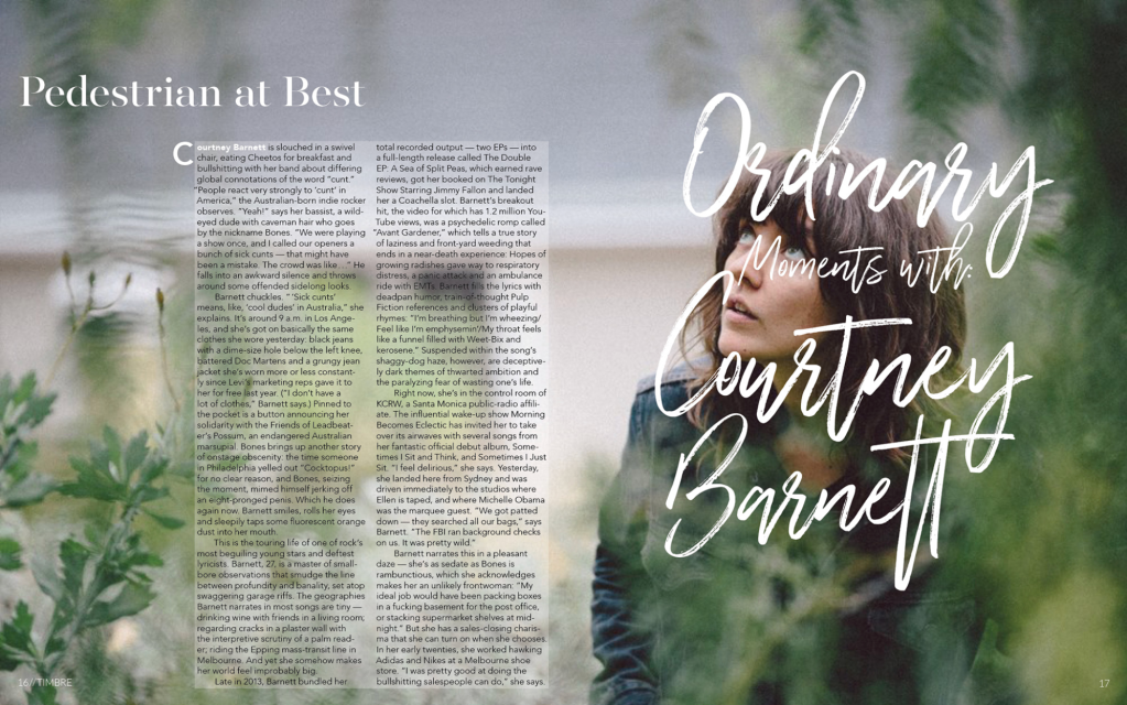
Combining different typefaces to create an appealing contrast in a magazine spread is not only about putting together the fonts that you like most. This week I learned how to identify the family each typeface falls under, and how to make effective contrasts that are eye catching, and appealing to the eye. I liked the feminine style of this particular magazine spread, and I’ll be using it as an example to showcase a some of what I learned. I’ll also talk about the photographic elements that are present. The magazine spread was designed by Alexandra Hartman: https://www.behance.net/gallery/64913525/Double-Page-Spread-Magazine-Layout. This design was created by her as part of an assignment for an intro to Typography class. The photographs and body copy are from other designers.

Typeface category

There are three different typefaces used in this spread, and they are each identified with different colors. The typeface circled in yellow is a Modern. We can identify it as such because the serifs are horizontal, and because there are radical think/thin transitions (contrasts in the strokes) on the letters.

The modern heading contrasts with the text and paragraphs on the spread because of its size, and the fact that they belong to different families. The paragraph text which is signaled in blue, has a Sans Serif typeface. This is the type that has no serif, or the small lines on the ends of the letters, like those on the modern typeface. Another way we can tell this is a sans serif typeface is that all the letters have the same thickness or weight all around. The texture doesn’t change on different parts of the letters.

The last typeface, which is circled in red, is from the Script family of typefaces. This typeface looks like it was handwritten with a pen because of its slanted lines and because you can see strokes in the letters. This particular font connects all of the letters together, but not all script typefaces have all of the letters connected to each other.

typeface contrast

These typefaces contrast very well because they are different from each other. First, the different styles that each typeface has at the ends of the letters give a pleasant contrast. The sizes are clearly different. The script is much bigger and takes up the whole right side of the spread, and the modern script which is the heading is much larger than the text. This allows us to be able to distinguish it as separate from the text, yet we know it is related to the text because of their proximity. Finally, we can appreciate a nice contrast in the text as the first two letters which, are the girls name who the author is writing about, are white, and the rest of the text black, which is a complete contrast from the white of the rest of the letters. The larger C at the beginning of the text draws the eye there so we know that is where the text begins.
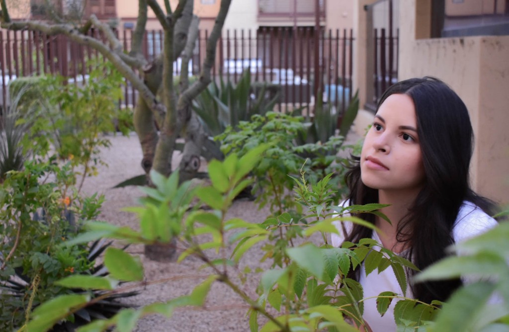
photography

In this picture, the photographic element that is most relevant in this picture is depth of field. The girl is in focus in the whole picture and the photographer has blurred out the background as well of some of the leaves in front of her to focus her in. Therefore, the photographic element most relevant in the picture is depth of field.

alternate images for layout

I took these images trying to replicate the overall design of the original photograph. Like the original, these photos have a depth of field behind the object in focus which is the girl. We have green leaves in the foreground, and I took these images outside on sunny days. The orignal picture doesn’t have a lot of sunlight, but in all of them, we can get a slightly warm feeling. Perhaps we would need to make the foreground on these pictures a bit lighter. The original picture has been modified on the part where the text was placed in order to make it a bit lighter so that the text would contrast and it would be easy to read. Overall, the design is very similar to the original photo. I had a lot of fun analyzing this, hope you’ve enjoyed!

Become Someone Else / Mint Vinetu: Design Principles

Unofficial Advertisement
Creative Director: Tomas Ramanauskas
Art Director: Gediminas Saulis

To place oneself in the shoes of characters in literature is the purpose of this campaign by Love Agency in Lithuania. Created for Mint Vinetu a bookstore in Vilinus. This sophisticated campaign puts the book covers with faces of characters over those of real readers, showing that any reader will identify themselves with some character in the classic literature Mint Vinetu caters to.

The message portrayed here is not the only creative aspect of this advertisement. The design principles used here give the ad and attractive, fun, and intelligent look.

Alignment

Alignment is the way that elements relate to each other in the whole space. The alignment in this image is flushed to the left. We can see that although the bigger text is a bit slanted, it is flushed to the left just like the logo and smaller text at the bottom. The woman’s torso and face are pointing to the left as well, following the same alignment as the text.

contrast

The use of this principle is usually the visual attraction that is most important on a page, and it clarifies the communication. Contrast understands that if two things are not the same, they must be very different.

We can appreciate contrast with a caricature face on the book over the face of a human woman. The contributors to this piece geniusly overlapped fiction over reality which allows for a great contrast that the viewers can enjoy, and it serves to clearly communicate the message.

Contrast is also present here in the different fonts that were used, as well as the size of the fonts. This contrast separates the texts to suggest that they are different. We can see that the difference is in the message they portray.

Proximity

The way that the objects are placed on the page tell us how they relate to each other. This is called proximity. this first arrow represents the relationship that the first text has to the photograph of the women with the book in her face. It is placed directly over her head in a way that when the viewer is finished reading his/her your vision goes directly to the photograph.

The second arrow shows how the book cover is slightly facing downward to the left where the smaller text, along with the logo are placed. This text (Pick your head…) explains the meaning of the photo (the women is identifying with a character by placing the book cover over her face.)

Finally, the text that reads “Pick your head at” is just over the logo of the library, indicating that that is the place readers can “pick their head.” There is a relationship between the phrase and the logo, hence why one is over the other.

repetition

When some aspect of the design is repeated throughout the piece, we call it repetition. In this piece, cursive writing is repeated in the book cover after the big text on the top left. Although they are two different types of cursive, they represent a repetition that gives a little bit of consistency throughout the design. Moreover, we can appreciate repetition in the bold texts on the bottom left to the bold text inside the library logo.

color

The color in a design can create harmony and in this particular piece, it creates consistency. The designers give a little bit of contrast in color with the woman’s red nails, her hair color, and the library logo, but color contrast is not the biggest thing they were going for with the color.

They had the contrary in mind. They decided to use different shades of gray throughout the ad in the background, the woman’s sweater, the book, and the small font on the bottom left corner text. The different shades of gray make the design very simple and calm.

These principles of design together make a very fun and unique design that portrays a special message to the viewer; readers can feel identified with the characters of the books found at Mint Vinetu. The colors and layout of the text and images all invite the viewers to do just that in a consistent and simple manner.